


Microsoft Excel 2007 Tutorial - Insert TabThe Insert Tab in Microsoft Excel 2007 will let you add external objects in your workbook. You can insert things pictures, clip art images, smart art graphics, charts, Pivot tables, hyperlinks, header and footer sections, etc using this Tab. The Insert Tab has the following groups that you can utilize to insert objects: -Tables Group -Illustrations Group -Charts Group -Links Group -Text Group For our lesson today we will be using my personal budget workbook. I have split my workbook into three sections, income, expenditures and balance. Here is a screen shot of our workbook. |
 |
Charts Group:Today I am not going to follow the groups in order as we have done in the past. I feel the charts functionality in Microsoft Excel 2007 is a vital concept to grasp. So for now we will skip over the other groups and focus on the charts first.When working with any numerical data, you can use charts to get important visual clues about the underlying information. Like the expression “A picture is worth 1000 words”, we can use this to our advantage in understanding the numbers. In our scenario what if we wanted to get the graphical representation of our budget data. We can easily do this by utilizing one of the many charts available in Microsoft Excel 2007. Let us say we would like to know the top expenses in my budget. We can easily create a chart that would answer this question. Go ahead and click anywhere in the expenses section. Then go to Insert Tab, click on column in the charts group and select 2-D clustered column from the dropdown. You will notice that we have a host of column charting options in the dropdown with a Live preview feature, Very Nice! After I made my selection, it generated a 2-D clustered column chart in our Excel workbook. Here is a screen capture of this action right below. |
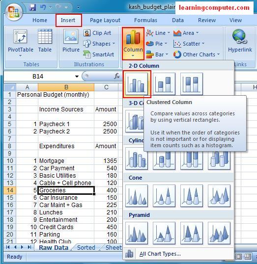 |
Now we can easily tell that Mortgage is by far my biggest expense followed by the car payment, credit cards and groceries, etc. Sweet! Microsoft Excel also generated the data points for my horizontal and vertical axes. And also it inserted a generic a legend on the right side of our chart. Finally it enabled the Chart Tools contextual menu in the Tile bar. |
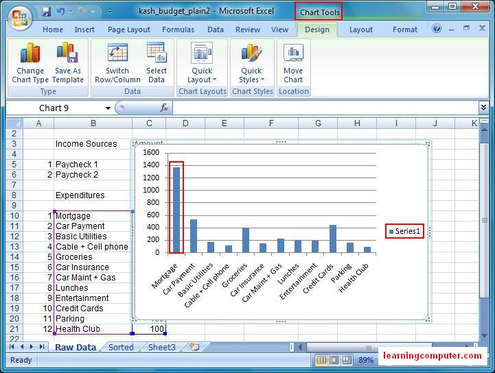 |
If you look closely, there are three tabs including Design, Layout and Format under the Chart Tools Menu. These tabs will let you fine tune your chart settings even further. Before we study the functionality under these tabs, I would like to switch my chart to maybe another chart type. If I click on Change Chart Type, it will open up a new dialog box shown as below |
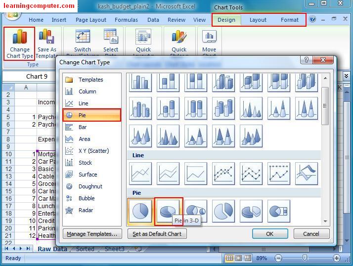 |
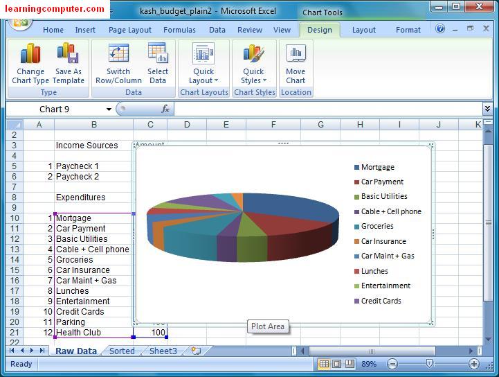
I will go ahead and choose 3-D Pie and then click on OK. Here is a screen capture right below. I think this looks a lot better than the 2-D bar chart that we had earlier. Now we are able to see the breakdown of our expenses by different color and size of the pie. Let us go ahead and save our personal budget workbook for now before proceeding onwords. |
 |
Let's explore the Design Tab a little bit more. Using the Chart Styles group, I can easily change the color scheme of my pie chart. I would like to use a strong color for the background instead of the plain white one that we currently have. How about style 42 of the black background? I like it so I will go ahead and select it and then click OK. Here is the command and the outcome of this action in the following two figures. |
 |
 |
Moving on I want to change the overall chart layout so I am able to see the Chart Title. From the Chart Layouts group, I was able to see a few predefined layouts when I selected the drop down list. I like Layout 6 with the chart title on top and the chart legend on the right side so I picked this one. Another cool feature I like about this chart layout is that our expenses are now broken down by percentage so my mortgage is 33%of my total expenses, I need a new house!! Here are the screen shots from the Chart layouts exercise. |
 |
 |
Different type of charts in Microsoft Excel 2007I want to explain the different type of charts in Microsoft Excel 2007 before moving onto of the next group. Here is a brief description on the chart types:-Column chart is the most common type of chart and is typically used to plot data against categories for example product types, Sales quarters etc. -Bar chart has the same effect as column chart except in shows the data across the horizontal axis stepped off the where to call axis. -Line and area charts are useful to show trends or time for example a stock price Chart displayed or time. -The pie chart is beneficial in understanding breakdown and allocation of quantity. This is the one be used for our personal budget. -Scatter also known as xy chart are useful in mathematical and scientific settings. They help you understand relation between X and Why values. |
Tables group:Let's switch gears and move back to the table group. This group will let you analyze your data using tables and pivot tables. We will cover pivot tables in an advanced video training, so let's try the table command.Utilizing the table feature, you can sort filter and format portion of your workbook. This gives you the ability to manipulate a subset of the data in an Excel Sheet. Go ahead and select the expenditure data is cells B8 through C20 as shown below. |
 |
You will get the Create Table dialog box where you can confirm the location and table header information. I'm going to simply click OK to move onto the next step. |
 |
When you look at the illustration below, you will observe that Microsoft Excel 2007 has now applied some formatting to our expenses data in addition to providing us with drop downs for headers. The drop down arrows are a handy feature that provide instant sorting and filtering capabilities. Here is a screen shot for your review. |
 |
You will notice that as you select the table, you will be provided the Table Tools Menu which includes the Design Tab. This is one of those contextual tabs that only show up when you are working with a certain object. Using this tab you can change the layout and formatting of your table. We would like to add some bright color to our table so let us browse to the Table Styles group. We will choose table style Medium 3 from our styles gallery. Notice as you move your mouse around, you will get a live preview of the new graphic settings. Here's the end result of our choice. |
 |
The last thing I want to talk about the tables is Sorting and Filtering capability. If I want to sort the Amount (Column C) from highest to lowest, I can click on the dropdown and choose sort largest to smallest. There's a screen capture of this action right below. |
 |
Now all the data in our table has been sorted from the highest to lowest expense in order: mortgage, car payment, credit cards etc. If you are satisfied with all the changes, go ahead and save the file. Here is what the final version of our Excel Workbook. |
 |
Illustrations group:We can now move on to the illustrations group and see how we can insert graphics into Excel workbook. Let's say that we need to insert a picture that portrays budget relevance into our Excel sheet. How can we achieve this task?We can click on Insert Tab and select picture command from the illustrations group. This will launch the insert picture dialog box where you can browse for pictures or images on your computer. In our case I'm going to use a sample pictures for our budget Excel sheet. Here are the two related screen captures for this task. |
 |
 |
The picture has been inserted next to our data. Observe that now we have the Format Tab on the Picture Tools ribbon. We can use it to further enhance our picture by using options like brightness, contrast, picture styles, alignment and size dimensions. I went ahead and used one of the picture styles from the galleries to give our picture a little rotation. Here's the effect of this command. |
 |
Using the Office button, you can do a Print Preview of your workbook. When I did this I was able to see the following figure. The looks pretty good with the data on the left, picture on the right and the Pie Chart on the bottom. Let's go ahead and save our document by clicking on the Save icon on the Quick Access Toolbar. |
 |
Text Group:I think we are close to being done with our personal budget workbook.We need just one more thing which is to add a Header section to our workbook. I can do just that by using the Header and Footer command under the Text group. This is where you can find the command |
 |
You will observe a few changes on the workbook now. Excel converted the layout view from Normal to Page Layout. This is helpful to see your data as it would look like when it is sent to the printer. In the old school days, you basically had to print and pray to Excel Gods for your screen view to match printer out, Not Anymore! We can see the margins on all sides of the worksheet in addition to the left/right rulers and column/row headings separated from the worksheet. We also see the header elements where I can enter additional information about my data. I went ahead and inserted text My Personal Budget into the middle element and also made a bold. I also inserted the date field in the left header section. Here is the screen capture of this. |
 |
Now when I do a final print preview, my Grades Excel workbook is professional looking as shown below |
 |


0 comments:
Post a Comment